Posts

Showing posts with the label thumbnails

Collaboration: Updated Uniform Desgins

Image
Further concept art after group discussion: Possible final uniform design: After some discussions with the group, I decided to continue on developing the uniform concept art for the skit. We decided that we wanted the majority of the uniform to be grey, with red and green highlights which were developed from the first group of uniform designs I constructed. We want to keep the uniform simple, as we will be adjusting them for the different children, so we still wanted it to be distinguishable through the different alterations and not to difficult so it will look good when applied to Moom.

Fantastic Voyage: Design Update

Image
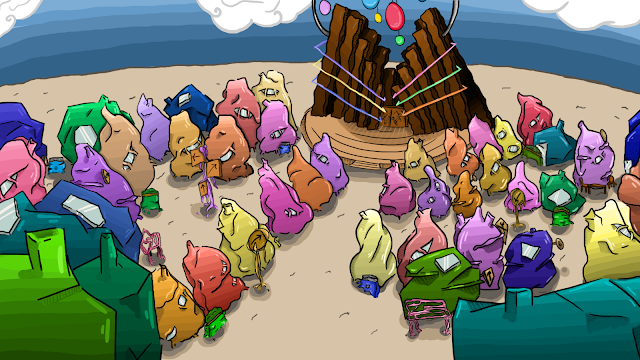
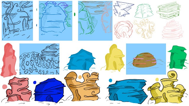
Before I started on my script I wanted to take on the design advice from my OGR in terms of the characters and the island, I aimed to make them in a more recognisable style, while still keeping the islands and the tortoises still simple yet individual enough so they can still be recognised in the animation. In terms of the direction of my story, I wanted to try and take this in the direction of story based games, ( like Animal Crossing or Pokemon Mystery Dungeon) so I was thinking about having the style of the story in a game format, while still having the tortoises evolution be told in a simple story that surrounds the game style. Im gonna aim to produce a few more thumbnails and a mood board back to back to my script so the project is still moving while I'm still formatting the style I want to tell it in.

Script to Screen: Character Thumbnails

Image
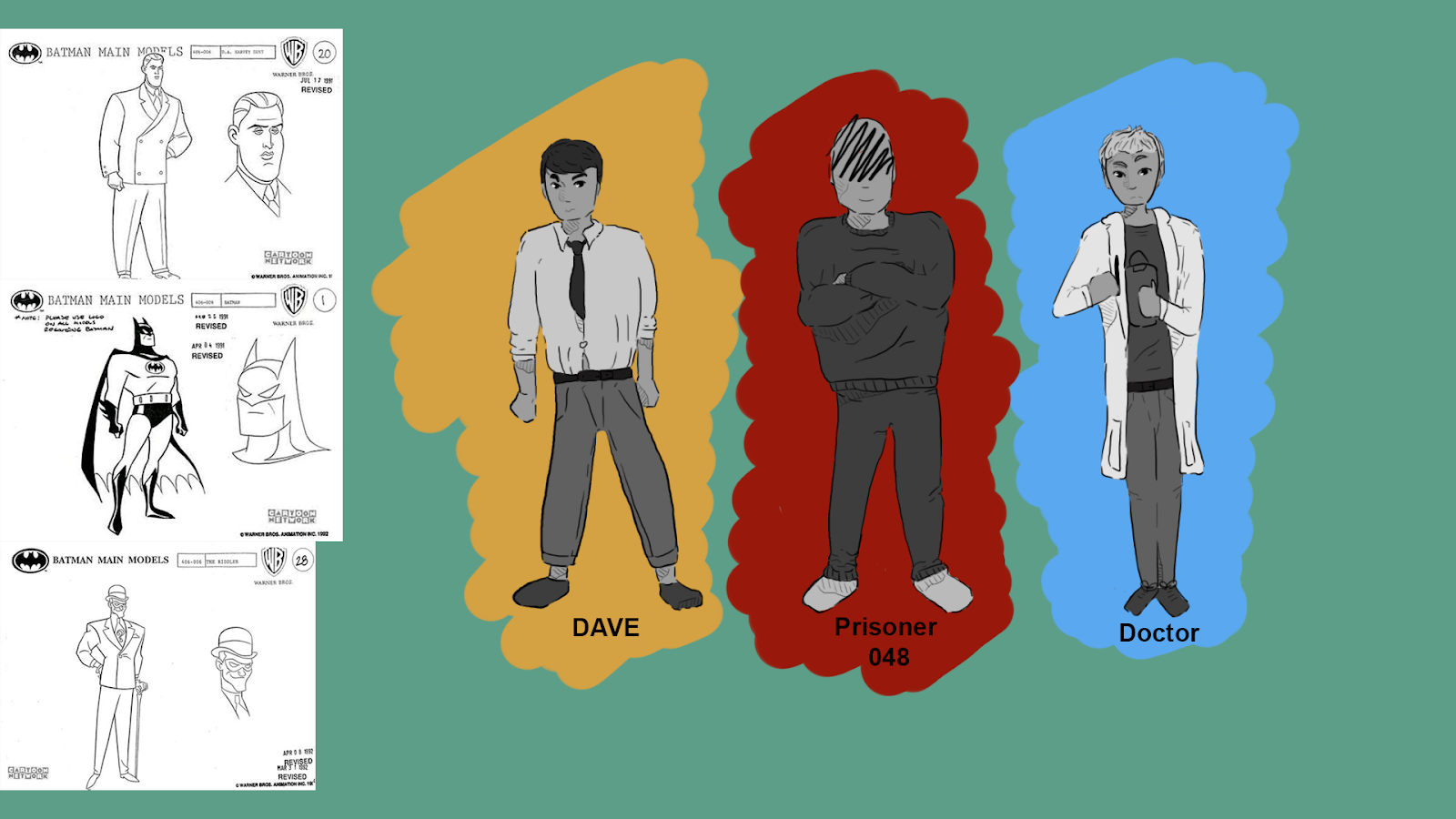
Some final designs for my three main characters in my story. I decided to adapt on my last thumbnails while also taking inspiration from some feedback on my OGR- looking at a more noir style, and concentrating on expressing the style of the characters more confidently. So for Dave the protagonist, I wanted to draw him when he becomes a body builder, but separate him more from Prisoner 048 by giving him a more rounded body, to show he's more kinder then Prisoner 048 who has a more square and sharper body size. The doctor I wanted to be more skinny, so he's separated from the prisoners, while still looking more confident even though he's smaller in size then the rest.

Script to Screen: Character Design- Dave

Image
Tried producing some more thumbnails on Dave, my protagonist. I want to develop him further using the prompts given in my feedback, however I wanted to try and get a general idea of him while I had more time and then see how I could develop him further. I think now I have a general idea of what I want him to look like, I'm gonna try and stylise him more along with the prisoner.

What if Metropolis Thumbnails 16: Pavements and Pathway's

Image
After some more feedback I decided to look at the pavement and roads, taking inspiration from Kandinsky's own work and using the layout I drew to draw out the pavements and roads that take up the frame. I still haven't decided what is what yet in terms of the colouring, but out of the three thumbnails I say I prefer the last one, as the design draws the eye to the hero prop, as well as the buildings around it, which i felt would help balance out the frame, as the hero prop already takes up a lot of the image, and I didn't want the pathway to heighten that, while also taking the eye away from the other buildings. I am planning onto next look at the floor colouring, as I feel its very basic in terms of tone against the wackily designed buildings and sky. 

What if Metropolis Thumbnails 15: Concept Art Tone Design

Image
After some feedback I decided to look at how the background would affect the scene so decided to compose thumbnails seeing how the times of the day would affect the frame and the buildings in it. Personally I like the sunset thumbnail, however I think that I need to research sunset images and designs to see how they would affect the scene more, as I don't think the colours affect the buildings as much as I would like, while also highlighting the Opera house, so that might be what I concentrate on next.

What if Metropolis Thumbnails 14: Concept Art (Line Art) and Thumbnails

Image
In creating my Concept art I am deciding to be a little more cautious with my designs, and I would appreciate some feedback regarding the design and also the layout. The issues that I have stumbled on are regarding how to fit all my objects in, such as the Opera, of which I want to be more of a centre piece of the village, as so has to be bigger than the other buildings, as well as the smaller objects like the signs and the bench. I drew up the first line art, but realised that I wouldn't be able to add in the Opera without the rest of the smaller houses and buildings, which would take up a large amount of time, unless I make them in the Matte painting. I have designs a thumbnail (see above) where the camera points down from the opera, looking down at the buildings and putting the Opera front and centre, but the angel doesn't show off the Opera very well or the houses, as only the curved ones would be seen from this angel as its closer to the building.

What if Metropolis Thumbnails 13: Building Orthographs

Image
After going through the designs that I came up with for the buildings and the shops, I decided to only use the extra rectangle props (the objects that look like canopies) on the shops, as I feel they make the building feel more like a shop or business, while also helping to visually separate the shops and restaurants from the houses. I didn't want to drastically separate the designs as within the city they are all grown and created form the residents, so keeping them similar would reflect how they view buildings and show how isolated the city it is from other influences. I only went with a cafe and a music repair shop orthography, as I only have a limited frame and wanted to only use buildings that would explain something about the city, so the cafe would show that the city is open for tourists and has a social side, while the music repair shop tied the music elements from Kadinsky and the cities creation into the design, for my OGR I will put this with the object ortholo...

What if Metropolis Thumbnails 12: Furniture and Buildings Design

Image
From some further feedback I decided to add more detail into my city by designing some props, like flower pots and signs that would go into making my city feel more realistic, as the original designs and thumbnails I had created I feel, felt very bland and repetitive until now. I tried to link the objects into the world, such as by sticking to the 'tree like' growth of the buildings in my other thumbnails, as I though it would be suitable to do the same for the poles and signs, with the actual signs being man made by the residents. I experimented with having wooden signs or the signs be made from the buildings themselves, but I feel the wooden ones are more suited as I'm worried that having the signs be brighter colours might make the scene too bright and bold, and so run the risk of looking extremely childish rather then like Kandinsky. The wooden ones I think add a bit of realism into the world, and help distinguish the man made from the growing structures.  ...

What if Metropolis Thumbnails 11: Sizing in Comparison

Image
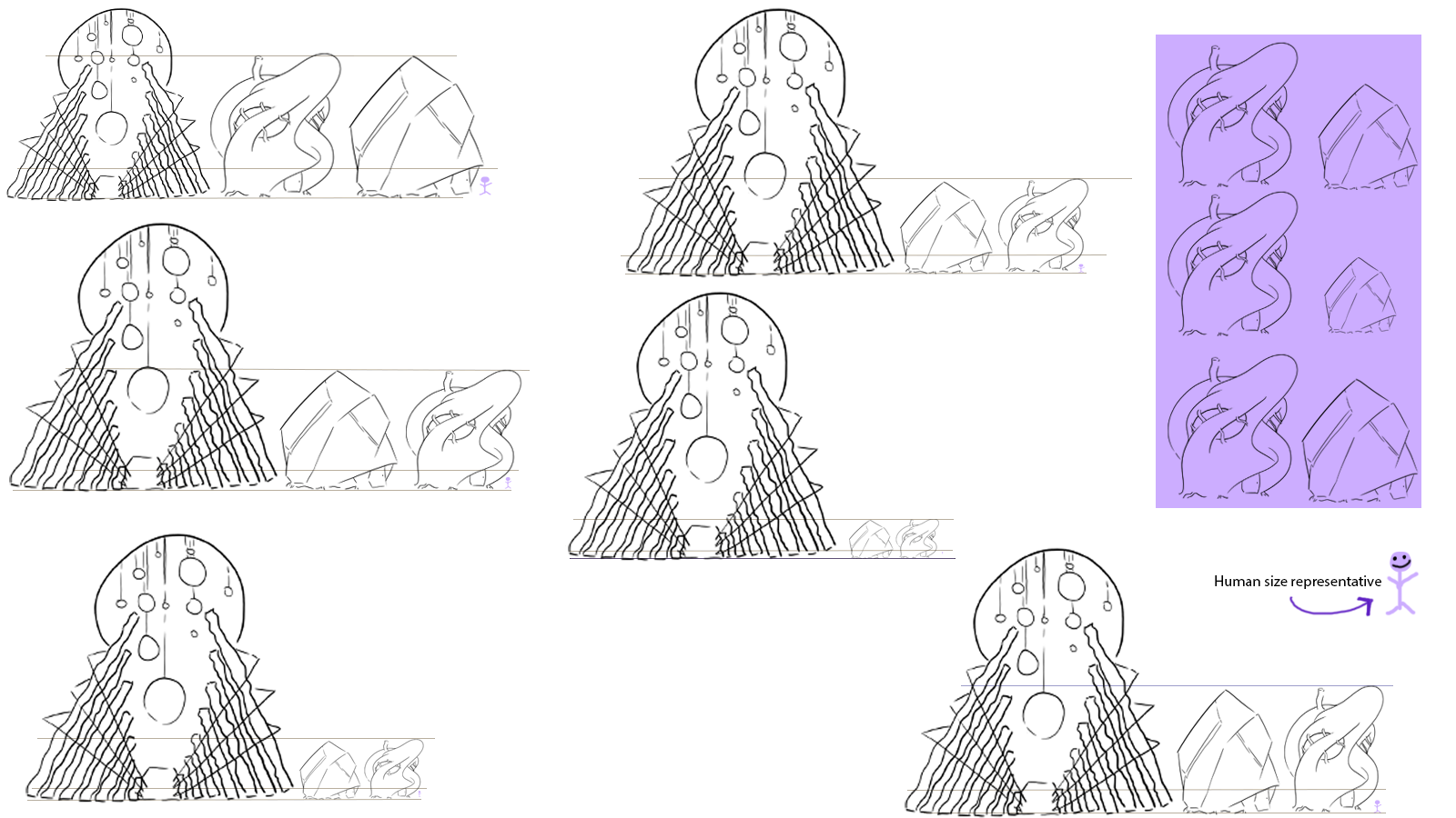
For this one, I wanted to experiment with sizing and size comparison before I composed my matte painting and thumbnails. This is because I knew that I would have a problem with sizing compared with my hero prop and the other buildings, so I wanted to create a visual guide that would help me when drawing the buildings so they wouldn't look inconsistent when creating it on Maya. I wanted to see how the building would hold up if they were the same size, or if I scaled them down which I don't think I prefer in the extreme, as I feel it might be a bit more difficult to capture the size of the hero prop in comparison to the builings in the painting effectively (but I am still open to opinion on this).

What if Metropolis Thumbnails 10: Colours and Buildings

Image
After getting some advice on colour I decided to try and be simple but creative with my colour patterns for my buildings and I think I have found some designs that I think fit with the buildings themselves. The hero prop I have also got some designs down that I think will work, but for this I think it's a case of making sure the extra features don't clash the design, while also making sure the design is appealing in of it self and links in with the rest of the city. I think in terms of the colours that link in with my other buildings (such as the reds, blues and yellows) I might stick with a more pastel colour as it links in more with the wood and doesn't, like the more darker colours make the buildings feel modern ( I feel the darker or harsher tones look like neon lights and add a more modern tone to it).

What if Metropolis Thumbnails 09: Building Design Progression 3: Hero Prop

Image
For this set of thumbnails I decided to look at the redesigns for the Opera, as I didn't like the ones that  I had originally composed in my first OGR. I decided to concentrate on structure, as well as the door design, but unlike the buildings, I had an idea of what door I liked, but I wanted it to look instead at a design that could appear to make the building more professional. Looking at the buildings in comparison, I like how the Opera does contains sharp and smooth elements from the individual building, while also standing out on its own, but like the others I will alter a few things from this design before constructing my final designs. I want to concentrate on colour for this building, along with the rest to try and continue the continuity between them.

What if Metropolis Thumbnails 08: Building Design Progression 2: Sharp Buildings

Image
Batch two for my building designs, this one was a bit more difficult to construct, because I had to design the sharper, more rough buildings different to my curved ones, while also keeping a consistent style flowing in both structures, and I think I managed to accomplish this, although I am still not as confident in these buildings as I am in the curved ones. I took inspiration from Japanese and Chinese temples for their sharp, tall structure and their use of angels and symmetry, while comparing that to modern architecture and seeing what I like and how I will apply it to my structures. I would still like to experiment with colour on the designs however, as there one note colour pallet is making them appear a bit bland, so I think I explore that after my final redesign for my Hero prop.

What if Metropolis Thumbnails 07: Building Design Progression 1: Curved Buildings

Image
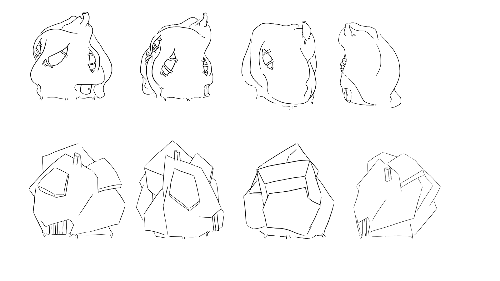
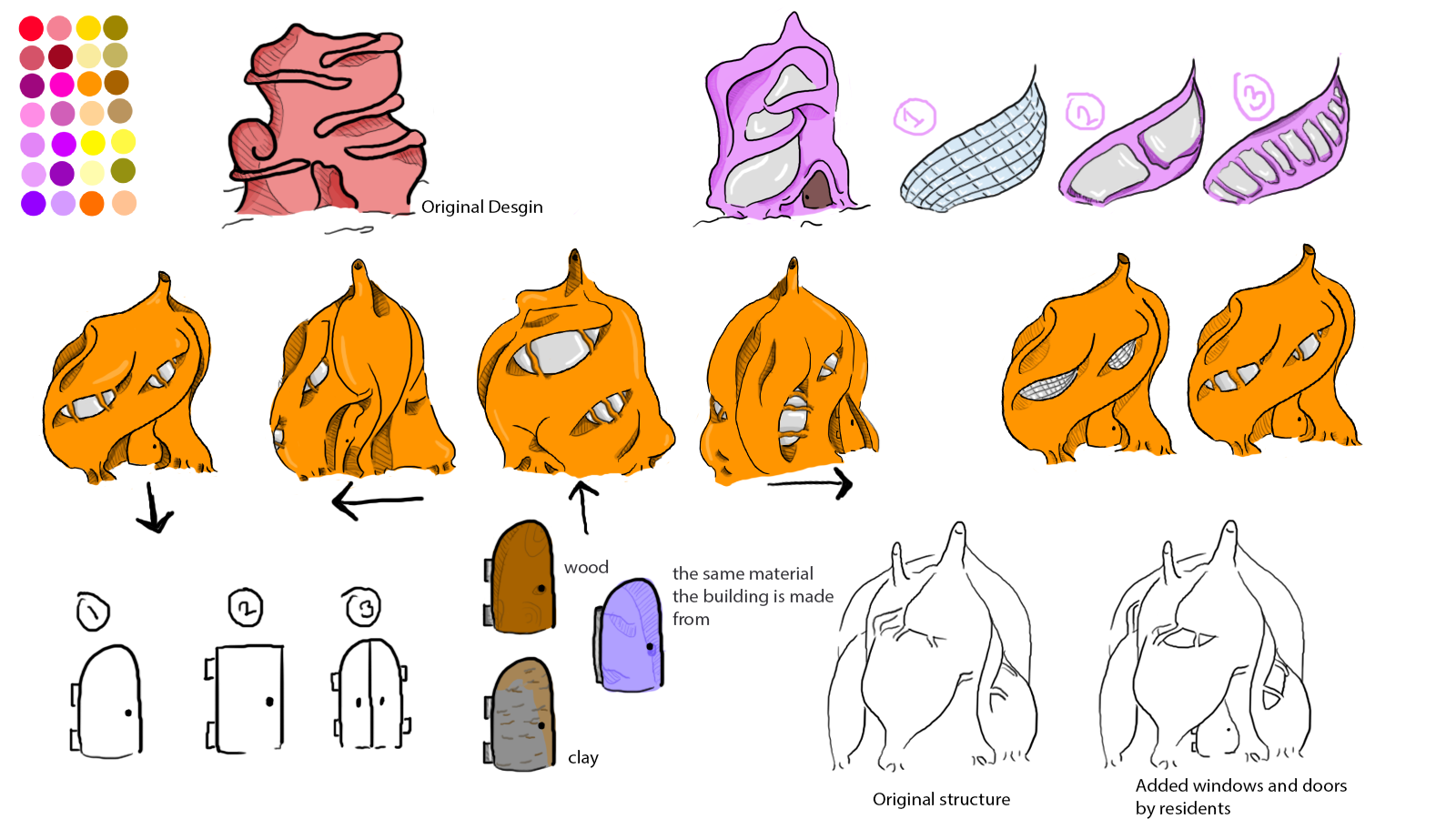
Taking on some more advice from my last thumbnails, I decided to look more in depth into the mechanics behind my buildings. So firstly, I decided to start this by looking at the curvy, light coloured buildings and finding a fixed design for them first, as I wasn't entirely satisfied with the ones I ended with in my original 75 thumbnails. I wanted to concentrate on establishing the universal style of them, as at this point I'm planning on each of the buildings being slightly different within their categories (so curvy or sharp buildings), but being recognisable through the different styles. Then, I  wanted to research and designs different doors and windows to see how I could change them up and how they fit within the buildings and the context from my travelogue. I looked at Zaha Hadid for these designs, as I felt the curvy, bend of the buildings suited the style I was looking for, while also looking at individual designs for the doors as I could find any door ideas ...

What if Metropolis Thumbnails 06: Design and Style Improvement

Image
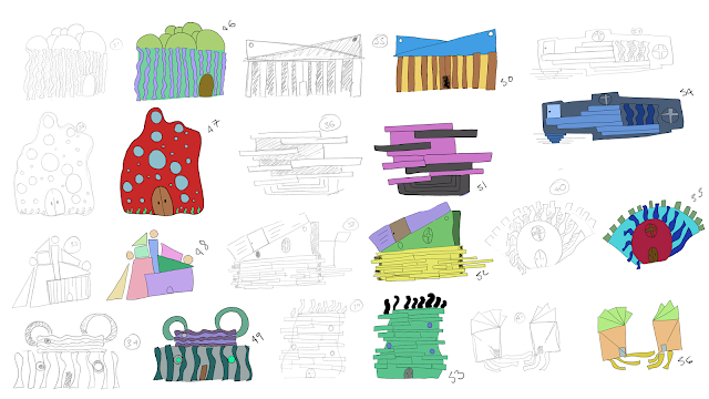
 After handing my OGR thumbnails, I decided to try and design some more ideas, as I didn't feel like the designs where quite there yet- in that I didn't feel my style was showing through as much, so in these re-designs I decided the aim was to try and find a style that would suite the design of the buildings and I think I have found one. Unlike my 75 thumbnails, I finally decided to try and produce designs only digitally, which has allowed me to experiment with the style of the buildings, as try and experiment with the separate buildings I described in my travelogue. as for the buildings, I still think I need to gain some feedback on their designs as I feel they are too simplistic, the top left hand side of this thumbnail page also has some alternate designs which I prefer more and might try and develop more in the future.

What if Metropolis Thumbnails 05: Colour and Emotion

Image
For this group I decided to try and focus a little on Kandinsky's colour theory, using primary and secondary colours to see how they would affect the structure, and the mood of the viewer as well and how they would play in the form of the building's, so how the reds and oranges would play in the softer structures and the blues would play on the harsher ones. I think for this one I might look at making the buildings more detailed for my second round of thumbnails, and also using stronger colours for the sharper buildings and pastel colours for the softer ones, as they create a more relaxed feeling.

What if Metropolis Thumbnails 04: Colour and Desgin

Image
for this I decided to try and experiment with colouring my thumbnails and seeing how adding colour can affect how the buildings come out, as I have found that some of the designs that I find interesting fall flat when I eventually add colour to them. for these designs I didn't concern myself too much with colour and emotion with these batch, I just wanted to see how colours would affect the buildings and how the colour would stand out and make them appear.

What if Metropolis Thumbnails 03: Size and Comparison

Image
For the first page of thumbnails I decided to look at height comparisons, seeing if I wanted the hero prop to be more bigger and prominent compared to the rest in the set or how I can differentiate it if it was the same height, while still keeping it similar to the others. The rest are more extreme examples of the opera design, looking at different shapes to see how that could affect the portrayal of movement within the buildings.

What if Metropolis Thumbnails 02: Hero Prop Concepts

Image
Carrying on from my first set of thumbnails, I wanted to try and focus on my hero prop, while still keeping the designs from my first thumbnails so the buildings wouldn't be too different. For this batch, and for my initial design I want my hero prop to be an Opera to carry into the theme of music and the symposia. The initial design although comes from the Globe theatre, because I liked its wide round design and open roof that I felt made it more inviting and open to allow the music to flow out and affect the rest of the set. I looked at different designs including the Globe theatre, as well as the Paris opera to see how different designs are used for the same purpose and how they fit to their environment.