Posts

Showing posts from November 11, 2018

What if Metropolis Thumbnails 13: Building Orthographs
Image
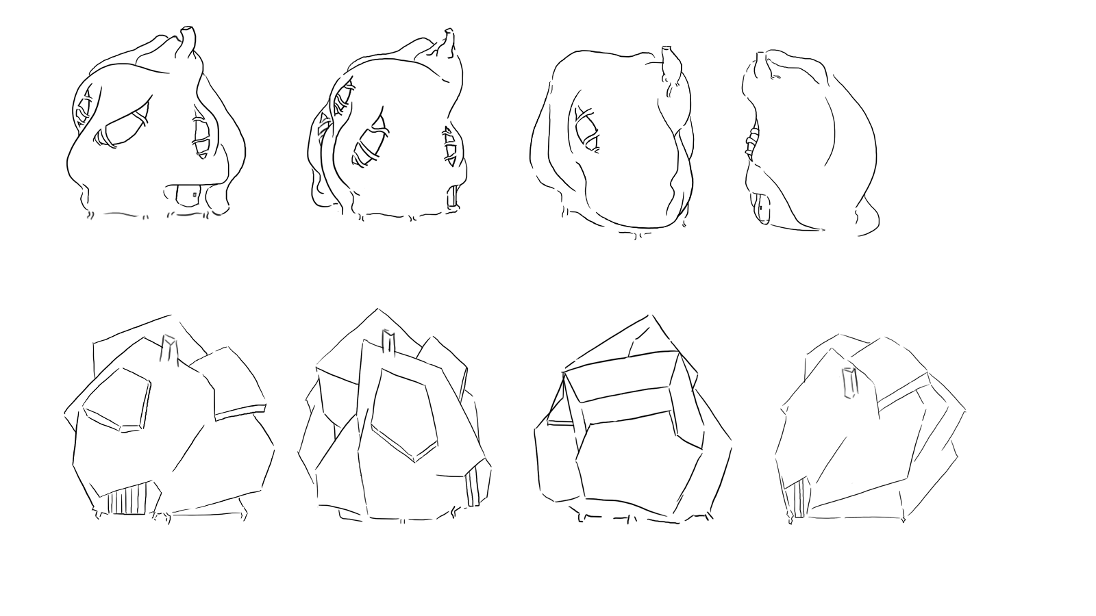
After going through the designs that I came up with for the buildings and the shops, I decided to only use the extra rectangle props (the objects that look like canopies) on the shops, as I feel they make the building feel more like a shop or business, while also helping to visually separate the shops and restaurants from the houses. I didn't want to drastically separate the designs as within the city they are all grown and created form the residents, so keeping them similar would reflect how they view buildings and show how isolated the city it is from other influences. I only went with a cafe and a music repair shop orthography, as I only have a limited frame and wanted to only use buildings that would explain something about the city, so the cafe would show that the city is open for tourists and has a social side, while the music repair shop tied the music elements from Kadinsky and the cities creation into the design, for my OGR I will put this with the object ortholo...

Black Narcissus and Otherness

Maya Chicken Coop

Image

Life Drawing 03

Image

Life Drawing 02

Image

Funny Walk Cycle

Image

What if Metropolis Thumbnails 12: Furniture and Buildings Design

Image
From some further feedback I decided to add more detail into my city by designing some props, like flower pots and signs that would go into making my city feel more realistic, as the original designs and thumbnails I had created I feel, felt very bland and repetitive until now. I tried to link the objects into the world, such as by sticking to the 'tree like' growth of the buildings in my other thumbnails, as I though it would be suitable to do the same for the poles and signs, with the actual signs being man made by the residents. I experimented with having wooden signs or the signs be made from the buildings themselves, but I feel the wooden ones are more suited as I'm worried that having the signs be brighter colours might make the scene too bright and bold, and so run the risk of looking extremely childish rather then like Kandinsky. The wooden ones I think add a bit of realism into the world, and help distinguish the man made from the growing structures.  ...

What if Metropolis Thumbnails 11: Sizing in Comparison

Image
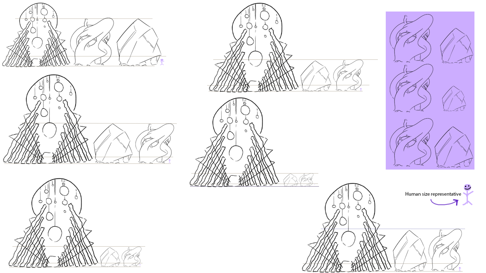
For this one, I wanted to experiment with sizing and size comparison before I composed my matte painting and thumbnails. This is because I knew that I would have a problem with sizing compared with my hero prop and the other buildings, so I wanted to create a visual guide that would help me when drawing the buildings so they wouldn't look inconsistent when creating it on Maya. I wanted to see how the building would hold up if they were the same size, or if I scaled them down which I don't think I prefer in the extreme, as I feel it might be a bit more difficult to capture the size of the hero prop in comparison to the builings in the painting effectively (but I am still open to opinion on this).

My Maya Van.

What if Metropolis Thumbnails 10: Colours and Buildings

Image
After getting some advice on colour I decided to try and be simple but creative with my colour patterns for my buildings and I think I have found some designs that I think fit with the buildings themselves. The hero prop I have also got some designs down that I think will work, but for this I think it's a case of making sure the extra features don't clash the design, while also making sure the design is appealing in of it self and links in with the rest of the city. I think in terms of the colours that link in with my other buildings (such as the reds, blues and yellows) I might stick with a more pastel colour as it links in more with the wood and doesn't, like the more darker colours make the buildings feel modern ( I feel the darker or harsher tones look like neon lights and add a more modern tone to it).

What if Metropolis Thumbnails 09: Building Design Progression 3: Hero Prop

Image
For this set of thumbnails I decided to look at the redesigns for the Opera, as I didn't like the ones that  I had originally composed in my first OGR. I decided to concentrate on structure, as well as the door design, but unlike the buildings, I had an idea of what door I liked, but I wanted it to look instead at a design that could appear to make the building more professional. Looking at the buildings in comparison, I like how the Opera does contains sharp and smooth elements from the individual building, while also standing out on its own, but like the others I will alter a few things from this design before constructing my final designs. I want to concentrate on colour for this building, along with the rest to try and continue the continuity between them.