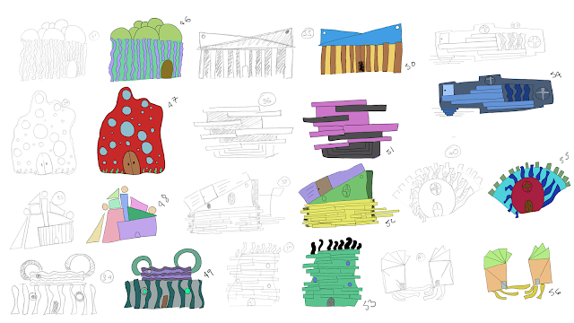
What if Metropolis Thumbnails 05: Colour and Emotion

For this group I decided to try and focus a little on Kandinsky's colour theory, using primary and secondary colours to see how they would affect the structure, and the mood of the viewer as well and how they would play in the form of the building's, so how the reds and oranges would play in the softer structures and the blues would play on the harsher ones. I think for this one I might look at making the buildings more detailed for my second round of thumbnails, and also using stronger colours for the sharper buildings and pastel colours for the softer ones, as they create a more relaxed feeling.


