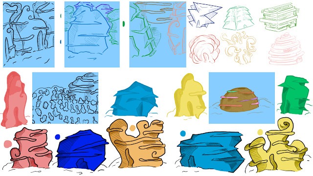
What if Metropolis Thumbnails 06: Design and Style Improvement
After handing my OGR thumbnails, I decided to try and design some more ideas, as I didn't feel like the designs where quite there yet- in that I didn't feel my style was showing through as much, so in these re-designs I decided the aim was to try and find a style that would suite the design of the buildings and I think I have found one. Unlike my 75 thumbnails, I finally decided to try and produce designs only digitally, which has allowed me to experiment with the style of the buildings, as try and experiment with the separate buildings I described in my travelogue. as for the buildings, I still think I need to gain some feedback on their designs as I feel they are too simplistic, the top left hand side of this thumbnail page also has some alternate designs which I prefer more and might try and develop more in the future.


Some very satisfying design sheets, Odette - working digitally obviously suits you! I think there's lots of potential here, but I think your next stage is to refine out a bit more of the 'wibble-wobble' of your profiles and forms, because architecturally, they still need to be better understood - I really like those little coloured line-art drawings on the top right of the top sheet for this very reason; they're beginning to look convincingly like that could occupy real space and support their own structures and weight. I also think you need to really commit to a sense of fabrication and also scale - for example, those 'balcony areas' running around some of your designs - are they usable platforms/terraces? If so, how much of the surface from which they protrude is coloured glass/viewing stations? There's an implication of 'doors' on some of the bases of your buildings - but they look huge to me, or rather they're shrinking your buildings into the side of sheds or Wendy-houses. This is where you need to go next - you need to think of these structures as objects in need of detailing working out...
ReplyDelete