Posts

Showing posts with the label Wassily Kandinsky

What If? Metropolis: Reflective Statement

Leaning from my last project, I managed to go into this one with a more structured system and priorities around the work load, I am proud that I was able to get a lot of the work done early so I was concentrating more on the main project in the last 2 weeks of What if? Metropolis. However this didn’t stop me from being stressed during the project, and rather then me feeling overwhelmed and not knowing what to do with the work load, this time I was able to manage it at the expense of it being the only thing I was able to do, so I still think I have a way to go with balancing my own time with getting the workload done and learning to let things go. At the same time, I do wish I had gotten the final render of this project done sooner, as I ended up finishing the day before the deadline, which meant that I didn’t have time again for small improvements to the project or feedback, so I would appreciate some help with this as well, as I feel I planned myself again into a corner that meant th...

What If Metropolis: Final Scene

Image

What If Metropolis: Digital Pipeline

Image

What If Metropolis: Final Crit Presentation

What If Metropolis: Art Of

What If Metropolis: Matte Painting and GIF

Image

What If Metropolis: Maya Scene So Far.

Image
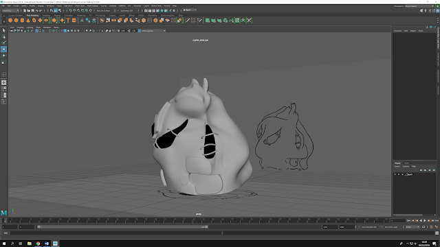
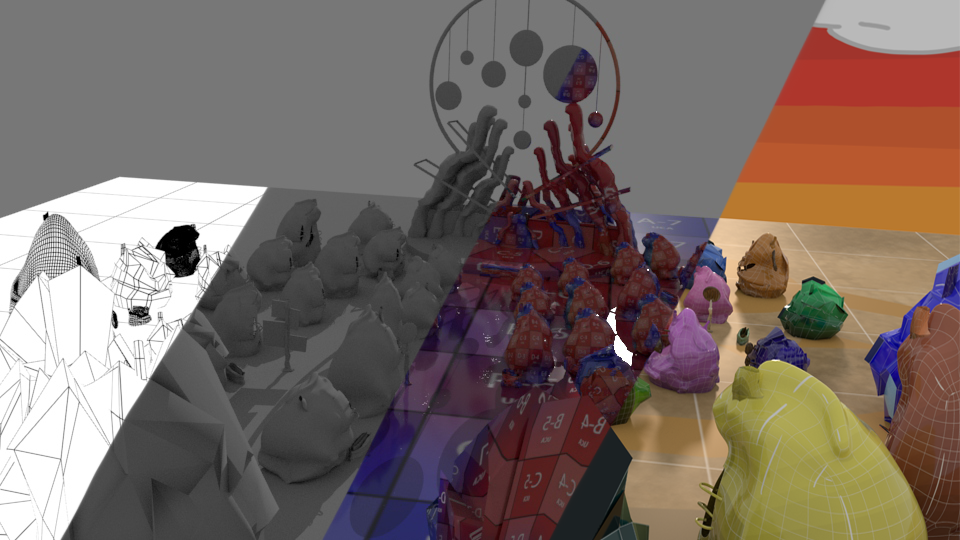
 This is how the city is going so far, managed to texture the bases of the houses, I just need to add detail to them to make them fit the concept art more. The Hero prop has proved to be the easiest object to design, and I decided to texture it all in Photoshop as well to keep the scene consistent, with the layering of colours being the only distinguishing feature between the organic objects and the man made ones.

What If Metropolis: Scene Construction and Camera Placement

Image
My efforts so far at constructing my scene in Maya, at this point I think I might have to make a few changed to the scene as a whole, as I don't think I will be able to completely re-create it, as I have constructed the buildings in Maya differently to the ones in the scene, which is proving some issues for me with the camera placement, as I'm struggling to capture buildings equally in the left and right hand sides, as well as getting the hero prop in frame like the concept art while also capturing items in the bottom frame. I will get opinions on this, and shift the frame around, but so far I think this is the angel I will be aiming to use.

What If Metropolis: Maya Objects 01

Image
Some more Maya objects for my city. I feel like I'm getting the hang of building these now, although I'm still nervous to see if they will hold up later down the line. The two signs i still need to add smaller details to, but so far I am pleased with them, one decision I have decided to make at this moment is to not build the bench, as I feel from trying to build some of the details on these objects that it might take too long, and I would rather put that energy to making some of the other objects better, however if I do get some time, I will try and build it just to see how it will turn out in Maya. 

What If Metropolis: Maya Curved Building 02

Image
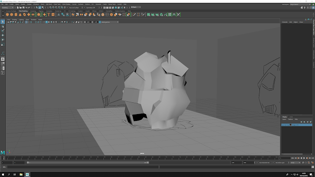
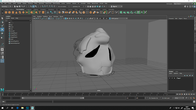
I managed to add on the curves on the window, that aspect has proved to be the most time consuming as i have to make sure the angel of the end of the curves is correct and that they also don't drastically change shape or wrap while I'm moving the vertices. So far I'm still quite happy with this building, and just need to add the door, windows and a few more of the curves before i get it checked out before editing the UV.

What If Metropolis: Maya Sharp Building 01

Image
This building was a lot more difficult to design and the one out of the two so far I am more nervous about, as I had to do a lot of the shaping on the un-smooth section of the design, so I will need someone to check the building when its smooth to see if its stable enough to UV and texture. Unlike the last building, I have opted to edit the windows on the building, so I will see how that goes later or if I need to separate the windows to make the windows look more realistic.

What If Metropolis: Maya Curved Building 01

Image
This is my first attempt at my curved building design, i found it rather easy to shape, however I am nervous about designing this because the majority of the design is on one shape.  i think before i proceed with the UV and texturing process i will get someone to check the design and see if its stable enough to continue with, i do still need to add in the chimney and and the doors, but so far i am happy with it.

What If? Metropolis: Final Concept Piece GIF

Image

What If? Metropolis: Final Concept Piece

Image
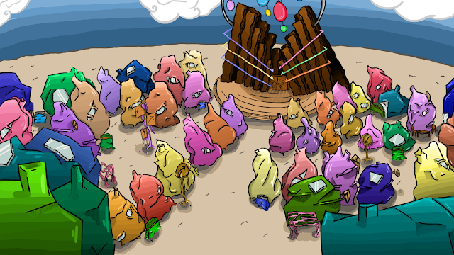
After continuing to improve on the piece, I thought I would finally upload a finished version, as I think after lots of little improvements I'm nearly finished (although feedback would still be appreciated) I looked at including some pathways and improving the floor to make the image more interesting, as well as using a sunset background out of the others that I added on, as the colours tie into the buildings bright colours more, without making the piece look too bold and childish.

What if Metropolis Thumbnails 16: Pavements and Pathway's

Image
After some more feedback I decided to look at the pavement and roads, taking inspiration from Kandinsky's own work and using the layout I drew to draw out the pavements and roads that take up the frame. I still haven't decided what is what yet in terms of the colouring, but out of the three thumbnails I say I prefer the last one, as the design draws the eye to the hero prop, as well as the buildings around it, which i felt would help balance out the frame, as the hero prop already takes up a lot of the image, and I didn't want the pathway to heighten that, while also taking the eye away from the other buildings. I am planning onto next look at the floor colouring, as I feel its very basic in terms of tone against the wackily designed buildings and sky. 

What if Metropolis Thumbnails 15: Concept Art Tone Design

Image
After some feedback I decided to look at how the background would affect the scene so decided to compose thumbnails seeing how the times of the day would affect the frame and the buildings in it. Personally I like the sunset thumbnail, however I think that I need to research sunset images and designs to see how they would affect the scene more, as I don't think the colours affect the buildings as much as I would like, while also highlighting the Opera house, so that might be what I concentrate on next.

What If? Metropolis: Online Greenlight Review 2

What if Metropolis Thumbnails 14: Concept Art (Line Art) and Thumbnails

Image
In creating my Concept art I am deciding to be a little more cautious with my designs, and I would appreciate some feedback regarding the design and also the layout. The issues that I have stumbled on are regarding how to fit all my objects in, such as the Opera, of which I want to be more of a centre piece of the village, as so has to be bigger than the other buildings, as well as the smaller objects like the signs and the bench. I drew up the first line art, but realised that I wouldn't be able to add in the Opera without the rest of the smaller houses and buildings, which would take up a large amount of time, unless I make them in the Matte painting. I have designs a thumbnail (see above) where the camera points down from the opera, looking down at the buildings and putting the Opera front and centre, but the angel doesn't show off the Opera very well or the houses, as only the curved ones would be seen from this angel as its closer to the building.

What if Metropolis Thumbnails 13: Building Orthographs

Image
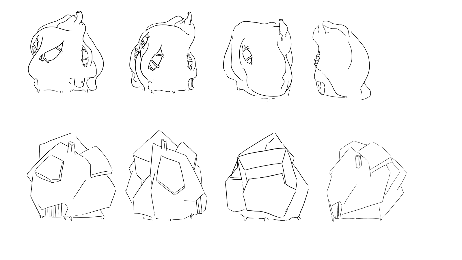
After going through the designs that I came up with for the buildings and the shops, I decided to only use the extra rectangle props (the objects that look like canopies) on the shops, as I feel they make the building feel more like a shop or business, while also helping to visually separate the shops and restaurants from the houses. I didn't want to drastically separate the designs as within the city they are all grown and created form the residents, so keeping them similar would reflect how they view buildings and show how isolated the city it is from other influences. I only went with a cafe and a music repair shop orthography, as I only have a limited frame and wanted to only use buildings that would explain something about the city, so the cafe would show that the city is open for tourists and has a social side, while the music repair shop tied the music elements from Kadinsky and the cities creation into the design, for my OGR I will put this with the object ortholo...

What if Metropolis Thumbnails 12: Furniture and Buildings Design

Image
From some further feedback I decided to add more detail into my city by designing some props, like flower pots and signs that would go into making my city feel more realistic, as the original designs and thumbnails I had created I feel, felt very bland and repetitive until now. I tried to link the objects into the world, such as by sticking to the 'tree like' growth of the buildings in my other thumbnails, as I though it would be suitable to do the same for the poles and signs, with the actual signs being man made by the residents. I experimented with having wooden signs or the signs be made from the buildings themselves, but I feel the wooden ones are more suited as I'm worried that having the signs be brighter colours might make the scene too bright and bold, and so run the risk of looking extremely childish rather then like Kandinsky. The wooden ones I think add a bit of realism into the world, and help distinguish the man made from the growing structures.  ...