Posts

Showing posts with the label Collaboration

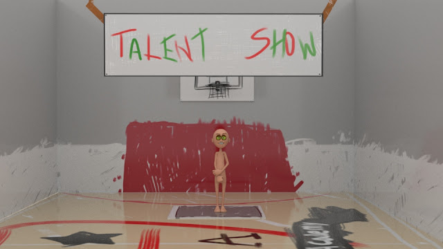
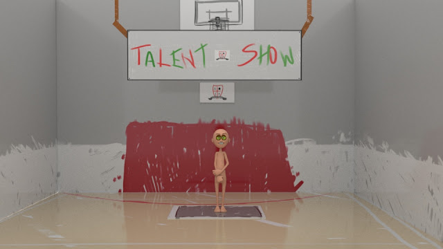
Collaboration: Reflective Statement

Overall, for the project itself I feel that the outcome came out very well and I’m happy with what we made in the end. I liked how we curated and placed the world within the story and I think overall it worked to support the theme of the talent show, despite the fact I was also worried that the concept would over run the initial prompt of “failed or forgotten superhero’s”, but I'm happy that overall it didn’t provide and issue and that we were able to make the project into something different from what the prompt suggested.  The way we organised the project overall, was because we were a pair we decided that by dividing up the children and their skits as  it would be more suited than just giving each other a scene, that way we would have more control over how we wanted the skits to look and if the project was too long of if we needed to make any last minute changes, we could do that without up hauling the entire project or impacting each others work. This did end up worki...

Collaboration: Magneto Update (With NCloth)

Image

Collaboration: Characters Animation Update (Bean Sprout and Juliette)

Image

Collaboration: Bean Sprout Test Animations

Image

Collaboration: Juliette Animation Start

<iframe width="560" height="315" src="https://www.youtube.com/embed/sw7xx4SWoSg" frameborder="0" allow="accelerometer; autoplay; encrypted-media; gyroscope; picture-in-picture" allowfullscreen></iframe> <iframe width="560" height="315" src="https://www.youtube.com/embed/ukJPzIA3zaw" frameborder="0" allow="accelerometer; autoplay; encrypted-media; gyroscope; picture-in-picture" allowfullscreen></iframe>

Collaboration: Magneto Animation Starts and Improvements

Image

Collaboration: Final Set Render

Image
After taking small adjustments and discussing it with my team, we have finally managed to come up with a final design for the hall where the talent show will take place. The designs are messy as we wanted the set to look like it was designed by the children themselves, which is why none of the designs are neat, and why even the school logo is messy as well, to emphasise this I also made a brush out of Mooms hands and used that on the back wall to show that the walls are meant to be messily painted. I also changed the colour of the back wall, because I felt that, along with the hands the wall looked like a murder scene, so I changed it to green, the other colour of the Atypical Academy and I think it brightens up the set more and allows the character to stand out better. Looking at this I feel that the walls and the signs nee to be less shiny, but overall i don't think we will need to make anymore changes to the set and we can now focus more on the characters and their outfits.

Collaboration: Scene Render with all Props

Image
Weights  Toy  Microphone and Stand  Keyboard  Spoons  Sheet Dynamite  Managed to finishing adding the shaders to the Uv's on the props while also improving the set as I went along. The props are designated to each character for their performance and I tried to keep them similar to the set, by using the same brush and messy colouring in that I have done on the set. I am happy with how they have turned out, especially since they are all 2D and I had to try and show their shape and design only using a flat ploy plane.

Collaboration: Scene Render with Symbol Change

Image
Because of the issue with the symbol and a talk with my teammate we decided to try and see how the symbol would look on the side walls or the floor to make the scene more interesting and not over crowd the back wall with too much information. Looking at the two images, I like the scene where the logo is on the floor, but I want to improve it more by pulling in the symbol more as I feel its too big and taking up the screen to much. 

Collaboration: Scene Render with Props

Image
Continuing on with the set I started to install and set up some of the props to see how the scene would play out and also if I need to change anything before we start animating. At this point looking at the last image I think I might get rid of one of the symbols on the wall, either the smaller one to make room on the wall to make the sign bigger, or the one between the text to make the text more coherent and the sign look more and made, but overall I'm happy with how its turning out overall.

Collaboration: Set and Prop Design Experiment

Image
Set Render With Moom Figure  Set Render with Added Prop 2D Basketball Uv Design I decided to continue on with experimenting with the design for the set, especially looking at how the 2D interactive props will play on set and look so I decided to start off by doing a quick design for the basketball that will be used by Michael Jordan in his skit and just firstly seeing how big it would need to be to appear on camera and also how the rough texture would be perceived from such a long distance. Looking at the render I am happy with how it appears and I feel that the audience will be able to see and recognise it from a distance. The second bit I did was importing one of the Moom figures and scaling and playing with the camera distance to see how well they will show up n the screen, this did lead to me needing to change the camera distance and we might need to extent the rest of the set to compensate for the opening shot, however so far I am still comfortable with how it a...

Collaboration: Set Prop Designs

Image
Basketball Hoop Prop Design  Mat Prop Design  Basketball Prop Design Continuing on with the set design, I wanted to try and test out the props that would go in the world and help to re-enforce its concept. I tried to keep this constant by putting the designs on boards and painting them roughly to make it feel more home made and childish, as we wanted the room itself to be designed for the children ready for the talent show so I tried to portray the objects enough so they are recognisable but not put too much design or detail into them to show that they are made by children. So far with the designs I am happy with how they have turned out, however at this point we might wan to think about how to make the designs look more like boards, maybe by adding on supports or a wood texture underneath, and also with props like the basketball we want to try and come up with a few designs so the props still look 2D and designed, but still work for the skits they are meant to be ...

Collaboration: School Set Design 01

Image
Test Rendered Set and Props  Test Set Render  Test Set Desgin Set Side Wall Design Set Floor Design Set Back Wall Design Leading up to transferring our project onto Maya, I decided to try and prepare a test render and design of the school sports hall on Maya, to see how it might turn out in a 3D layout and start thinking about different ways we could improve it. Initially I wanted to have the images be projected onto the 3 image planes and rendered from there however I found that they didn't show up in the render view so I had to thin and stretch out four cubes and project the wall designs on the Uv's, which I felt has done a good job at creating the set like appearance we are going for. I also wanted to try and see how the props, such as the basketball hoop and the mat would look and so far I am also happy with the effect they are creating within the set, and I think it helps to amplify the world we are trying to project, which is also why I also de...

Collaboration: Set Design Update

Image
After speaking to Alan we decided on a style that we want to use and carry onto the final design. This is inspired by the background design from the 70's Paddington Bear, where it was hand drawn and looked very fake and supported by stands, which we thought would be a nice stylistic choice to make the set and the world feel more unique as well as to act as an aid for some more gags in some of the children's skits. We also wanted the world to look like it was designed by the children, which is why we decided to make the line art and colouring so rough and flat, as we thought it would add a certain charm and make it easier for the audience to understand who designed it. In Maya, we are thinking for tying to create this idea by using the Image Planes to model the set and then maybe flatten some cubed to act as smaller bit of card to project the basketball hoop and the mat on.

Collaboration: Character Update and Updated Storyboard

Image
Moom Character Desgin (Joe King) Updated Storyboard (Joe King) After looking over the characters we currently have, the team have decided that it would be best for us to cut and change some of the struggling characters, with two of mine being Joe King and Burnham G. I decided after struggling to come up with a skit for the King twins that I would scrap them both, however use Joe's name to replace Burnham's, as I felt that his old name was too violent and wants making sense with the updates I had to make to him, as well as I had to change his skit so it represented the brief more, which is an issue we are struggling with as we finalise these characters and move forward in the project. So far I am happy with the update on Joe (formally Burnham) and feel that his skit fits more with the brief and ties the story together as well as his final Moom design.

Collaboration: Storyboards Part 01

Image
Emo Juliette  Burnham G "Captain Fantastic" Looking at the five out of ten children I got assigned to develop, I have started storyboarding the three that I am most comfortable with at this point and feel that can applied to the final story. The two at the top I feel are going to be fairly long and especially the top one might have some editing added in the final story to divide up the time and make the scene more funny, while the last one will be fairly short and quick, so it can be a fast gag to break up some of the other, longer gags. I still have at this point two more storyboards to do, with one characters story being changed to it might take a bit longer to create.

Collaboration: Moom Action Poses Part 01

Image
Character Line Up  Bean Sprout  Emo Juliette   Joe K  Burnham G  "Captain Fantastic"  Mar K After the lessons with Alan and looking at different ways to portray the personality of the character through actions and poses, I tried to apply this to the five kids that I have been assigned to update and create the skit for, to then eventually combine with the other five later to then make the whole story. Apart from Bean Sprout I tried to keep Moom's size the same and look at a variety of poses and references until I found the one I felt portrayed the child the best, such as Burnham who is the class maniac and I wanted to use an action pose to show his wild energy and change Moom's expression to show how he feels about the action. Some of the kids, like Bean Sprout and Juliette I feel more comfortable with developing at this point, however Joe and Mar I'm still unsure of and might change their character to suit some of the develo...

Collaboration: Character Design Part 1

Image
Bean Sprout Emo Juliette  "Captain Fantastic" At this point I have I started designing the uniform on the children, combining the personalities of the children with the uniform to make them stand out and feel more unique. These kids I feel at this point are the ones I'm most comfortable with in terms of design and their individual skit and although I still have two more to design I feel comfortable moving them onto applying the UV texture onto Moom and try to create an animatic of their skits for reference.

Collaboration: Updated Uniform Desgins

Image
Further concept art after group discussion: Possible final uniform design: After some discussions with the group, I decided to continue on developing the uniform concept art for the skit. We decided that we wanted the majority of the uniform to be grey, with red and green highlights which were developed from the first group of uniform designs I constructed. We want to keep the uniform simple, as we will be adjusting them for the different children, so we still wanted it to be distinguishable through the different alterations and not to difficult so it will look good when applied to Moom.

Collaboration: Uniform Concept Art

Image
As well as designs for the environment, I also decided to get strand on some rough ideas for uniform designs. For the first lot I thought it would an interesting nod to base the uniform deigns off some famous superhero colour schemes, as well as it make it easier to narrow down some designs so they don't become to complicated down the line, my favourite from the designs it the Iron Man one at this point, as I think the colours go nice together and they make an interesting uniform design. But incase we decide that we wouldn't like to do that, I also started on a  few basic designs for uniforms that we could look back on instead.