After getting some advice on colour I decided to try and be simple but creative with my colour patterns for my buildings and I think I have found some designs that I think fit with the buildings themselves. The hero prop I have also got some designs down that I think will work, but for this I think it's a case of making sure the extra features don't clash the design, while also making sure the design is appealing in of it self and links in with the rest of the city. I think in terms of the colours that link in with my other buildings (such as the reds, blues and yellows) I might stick with a more pastel colour as it links in more with the wood and doesn't, like the more darker colours make the buildings feel modern ( I feel the darker or harsher tones look like neon lights and add a more modern tone to it).

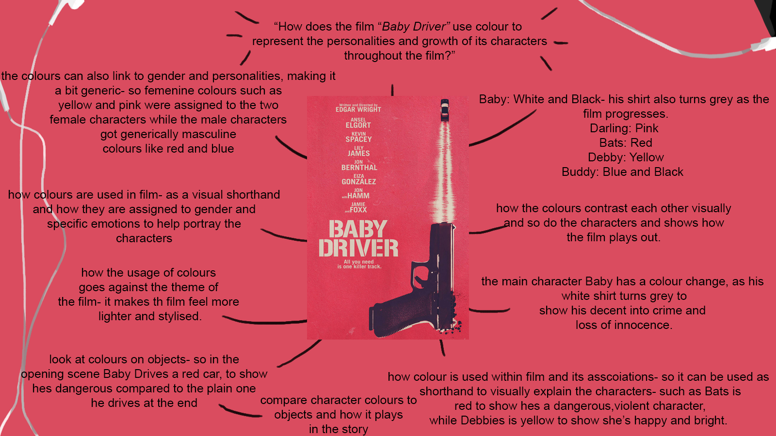


So... looking at these maps, I think there's a risk that you're not connecting with a specific enough theoretical framework; you need something meatier for a 2000 word assignment, which will require of you that you demonstrate good technical knowledge of a theoretical context. My experience is colour theory can quickly encourage a student to become 'descriptive' - I'm wondering if Baby Driver is 'ideas-driven' enough, as my experience of that film was that it was wonderfully entertaining and joyously superficial... like much of that director's work. Can I ask you to consider some additional potential topics, as most of your classmates thrashed out three different possible case-studies. I'd suggest perhaps that you need to look at things that are more possibly 'problematic' or 'under tension' so as to create lots of room for debate and discussion...
ReplyDelete