Popular posts from this blog
Moom Platform: Blocking Removed and Graph Editor Improvements
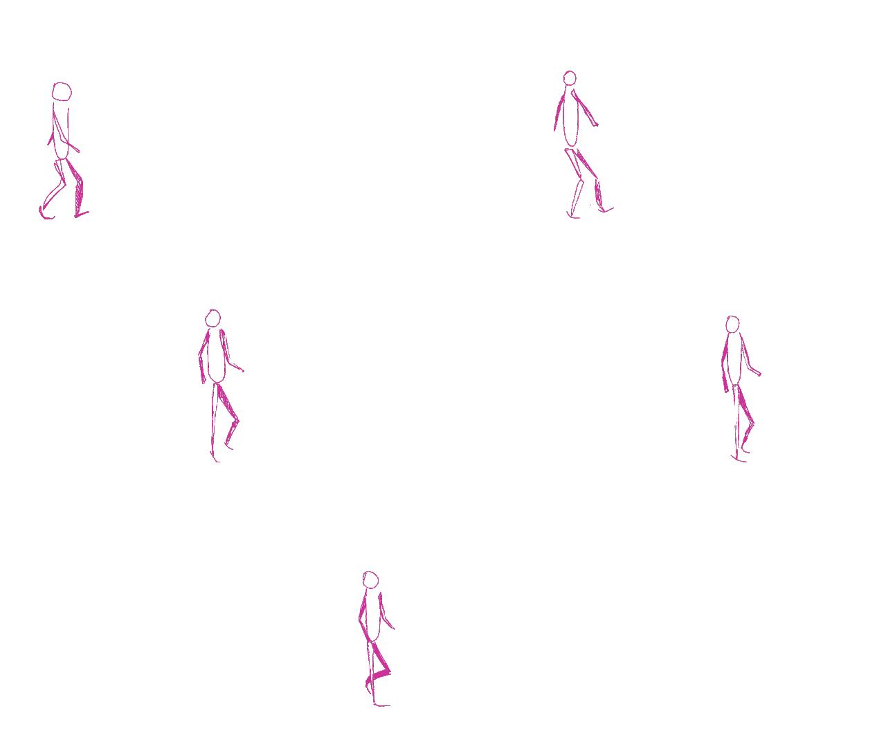
For this lesson we had to think about timing and had to try and a-just the animation to the characters movements by removing the blocking and trying to line up the time with the movement and the expressions. I found this lesson quite easy especially since I feel I am now more used to blocking and animating using that technique, however I am still not, I feel as comfortable with using the graph editor, but In the second video I think my attempt to try it on the hip CTRL worked well, and although I still feel like the animation needs some more cleaning, I think it's turning out rather well.
What if Metropolis Thumbnails 09: Building Design Progression 3: Hero Prop
For this set of thumbnails I decided to look at the redesigns for the Opera, as I didn't like the ones that I had originally composed in my first OGR. I decided to concentrate on structure, as well as the door design, but unlike the buildings, I had an idea of what door I liked, but I wanted it to look instead at a design that could appear to make the building more professional. Looking at the buildings in comparison, I like how the Opera does contains sharp and smooth elements from the individual building, while also standing out on its own, but like the others I will alter a few things from this design before constructing my final designs. I want to concentrate on colour for this building, along with the rest to try and continue the continuity between them.


There's something about the combination of your loose style and then the line-art in those little supporting studies that I think is beginning to work nicely - and it feels like it could feed back into your rendering of your establishing shot and the rest of your scenes: take a look at these example of animation backgrounds in the UPA-style for a sense of what I mean and how you might embrace confidently what you've established so promisingly in some of those cute little studies:
ReplyDeletehttp://animationbackgrounds.blogspot.com/2009/12/
https://www.pinterest.co.uk/pin/491385009314703154/?lp=true
You'll see they're a combination of flat colour, intermittent texturing and strong line art - there are elements of this getting started in your work here - and I think you could dial it in more boldly :)